Back to the drawing board! These design fails are so far off the mark they should never have seen the light of day
From a typo to bad wording, or a small quirk in the design, all it takes is a small error to completely ruin a product and leave people confused.
But these examples really do take the biscuit and they may even leave you struggling to understand who signed off the idea in the first place.
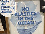
Cheezburger have put together a thread which features poor designs from around the world, including a picture frame on sale in America with a picture of a blue whale and a slogan, saying: ‘No plastics in the ocean’.
This would be an admirable message if it weren’t for the fact that the item came wrapped in plastic.
A clothing brand seemed to be in such a rush to get their product out to stores, they forgot to finish designing the t-shirt, which featured the words: ‘Your tagline here.’
Mixed messages! A store in the US was selling this picture frame, which ruined its environmental message thank to a plastic wrapping
American fast food giant McDonald’s attempted to be inclusive to blind customers with a sign, saying: ‘Braille and picture menus available’.
However, the sign itself was not in Braille, which rather defeated the purpose.
A restaurant in Brazil also put the signs on their window the wrong way around, so it read ‘conditioned air,’ rather than ‘air conditioned,’ and ‘Wifi free,’ instead of ‘Free Wifi.’
Here FEMAIL have picked the worst designs which will leave you either feeling frustrated or scratching your head.
Not lovin’ it! US fast food giant McDonald’s tried and failed to be inclusive with this sign advertising Braille menus
Not such a beauty! The design of this box at a store in the US made the model on the front look rather odd, and probably won’t encourage anyone to buy the eye and lip therapy tool within
Not in control! The person who made this remote may want to rethink their design, because you may think you’re turning the volume up when in fact you are doing the opposite
This Pepsi cup has two holes in the lid, one on the front and another on the side, meaning that when you drink, it will spill on your lap
American sandwich shop Subway’s tagline ‘eat fresh’ has made it look as though they are telling people to eat next door
That’s shirty! The creator of this t-shirt was clearly in a rush to get out to stores because they forgot to write a tagline
What a crock! This bowl was clearly designed to be displayed rather than used because there are holes in the side, meaning that the food would just fall out
Despite this saloon bar, located in Fairfax, Virginia, being called Peri’s, the font has made it look as though it named after the male organ
That’s what you get for boasting! In this American hardware store, it says this platform can hold up to 1,000lbs, but it has been knocked over with just 810lbs
This restaurant in Brazil put their signs the wrong way around – no doubt causing some confusion for customers
That’s not how you make a sandwich! This poorly-designed sign from American brand Upstart shows a knife spreading mayo on top of a sandwich rather than inside it
Already disturbed! The presence of two light switches outside this Holiday Inn hotel room is strangely unnerving
Share or comment on this article:
Source link
CHECK OUT: Top Travel Destinations
READ MORE: Travel News