Lyle’s rebrand of their golden syrup last week prompted fury from some Christians for hiding the beliefs of their founder in the iconic design he created.
The firm’s decision to modify their logo – made up of a dead lion and some bees – sparked outrage from the Church of England, who suggested the move had left them pondering whether ‘there was any place’ for Christians in the UK.
For over 150 years, the logo was a reference to the biblical story Samson from the Old Testament and included the biblical allegory: ‘Out of the strong came forth sweetness.’
The modern branding now shows a lion’s face up close with a single bee and it has removed the religious quote, which has prompted Lyle to apologise for any upset caused by the switch.
The scuffle illustrates that many of Britain’s favourite brands carry hidden messages in their packaging. MailOnline examined the messaging of several popular brands – how many do you know?
Marmite
Marmite is actually a French word meaning large cooking pot – hence the appearance on the logo
Marmite is a brand that people either love or hate, so with that 50 per cent split in consumers, it’s likely even fewer people know what the actual logo signifies.
The yeast extract spread features a red banner emblazoned with the Marmite brand and below that an inviting or ominous yellow pot, depending on your preference.
For generations, Brits have wondered what the significance of this pot was.
MailOnline can now reveal it is actually shockingly nothing to do with the taste or even, gulp, Britain.
Marmite you see, is actually a French word, meaning large cooking pot.
So, when you are trying to rationalise that iconic marmite taste, remember it’s based on a piece of crockery.
HP Sauce
HP Sauce is a brand that stretches back to Queen Victoria’s reign and has long been associated with parliament
HP Sauce is a brand that stretches back to Queen Victoria’s reign and every day thousands of Brits dollop the brown sauce on their breakfast sarnies.
The sauce’s logo features that most elegant of British institutions, Big Ben itself, standing high and tall against the London sky – but why?
In fact Frederick Gibson Garton, a Nottingham grocer, first formulated his recipe in 1870, and registered the name HP Sauce in 1896 because he had heard that a restaurant in the Houses of Parliament had begun serving it.
He later sold the recipe for £150 to settle a debt with Edwin Samson Moore, who went on to make HP Sauce a commercial success with a national launch in 1903.
While the bottles carry the image of the mother of Parliaments – along with a Royal Warrant, on the basis that it is served at Buckingham Palace – the sauce is no longer quite as British as it might seem.
Heinz closed the HP Sauce factory in Aston, Birmingham, in 2007 with the loss of 120 jobs and shifted production to Holland.
Cadbury
The signature glass and a half symbol relates to how milk is put into each half pound bar
John Cadbury founded the Cadbury’s in 1824 in Birmingham, in the United Kingdom.
In 1921, the first logo to appear was based on then director William Cadbury’s signature. But it was only in 1960 when the logo appeared on other chocolate bars
For over 100 years, Cadbury’s chocolate has been swathed in a distinctive purple wrapping that made it stand out from rivals.
The confectionery giant has used the colour since 1914, when it was introduced as a tribute to Queen Victoria.
Cadbury was given a royal warrant by the monarch in February 1854 – making the company the official cocoa and chocolate makers for the monarch.
The full Dairy Milk range became purple and gold in 1920.
Fans of the iconic chocolate have often pondered the significance of the glass and a half of milk motif that adorns the packaging.
But far from a veiled brag about how much milk John Cadbury could drink in one go, the symbol actually relates to how milk is put into each half pound bar.
Toblerone
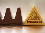
Toblerone is one of the world’s most iconic and moreish chocolates
On the left hand side of the peak, what first looks like a snow slide is actually revealed to be a bear
Toblerone is one of the world’s most iconic and moreish chocolates, as hated by dentists as it is beloved by Alan Partidge.
The Swiss classic has been made since 1908 and features a hidden symbol of a bear in its famous mountain logo.
On the left hand side of the peak, what first looks like a snow slide is actually revealed to be a bear once you squint.
And it’s placement on the logo is not as as random as you’d think.
The bear represents the Bern bear because the chocolate is made in Bern, Switzerland.
Heinz
The ’57 varieties’ label represents the variety of products that Heinz has
Heinz ketchup is a popular household staple for many Brits, who will be familiar with the ’57’ on the neck of the bottles.
However, people may be surprised to learn that the number not only has a meaning behind it, but also serves a functional purpose.
The ’57 varieties’ label represents the variety of products that Heinz has, but the number was actually selected at random by founder Henry Heinz himself.
He didn’t have 57 varieties when the brand began. Instead, it was a clever way to create authenticity and attract customers.
The Heinz website explains: ‘When he spotted a shoe company advertising 21 styles of shoe, he was inspired to create our iconic 57 varieties slogan.
‘Why 57? No one knows for sure. Henry claimed five was his lucky number, and seven was his wife’s. But he also believed seven was a significant number for people of all ages. Whatever his reasons, the number stuck around!’
Starbucks
Starbucks’ famed green and white logo features a Siren from Greek Mythology
It’s the largest coffee house in the world and a favourite haunt of many Brits, but Starbucks may have had a very different story had one of its founders had his way.
Writer Gordon Bowke, who co-founded the company in 1971, originally wanted to name the company Peqoud, after the doomed whaleship in Moby-Dick.
Luckily, his business partners settled on the name of the ship’s first mate instead.
It also inspired Starbucks’ famed green and white logo, which features a Siren from Greek Mythology.
As the story goes, Sirens lured sailors to shipwreck off the coast of an island in the South Pacific, also called Starbuck Island.
Closer inspection of the logo, known as ‘the siren’, reveals that the shading around the right eye drops further down that the left.
Creative consultancy Lippincott were given the job in 2011 of updating the image, which had been around since 1971, originally appearing as a mermaid.
But despite studies showing that people are attracted to symmetrical features, they came to the conclusion their original creations were too perfect – and cold.
Global creative director Connie Birdsall told Co.Design, the team thought to themselves: ‘There’s something not working here, what is it?”
‘It was like ‘Oh, we need to step back and put some of that humanity back in’. The imperfection was important to making her really successful as a mark. We didn’t want her to be perfect, like Barbie.’
Lurpak
Lurpak’s lurs are a traditional Scandivanivian instrument from as far back as the Bronze age and point to their Nordic heritage
One of the nation’s favourite condiments is butter and Lurpak commonly ranks in the upper echelons of dairy spreads most of us rely on every day.
In fact, so beloved is the brand, shoppers were shocked to see that the cost of living crisis saw packs rise to £10 in some stores last year.
The butter is emblazoned with its signature logo showing two intertwined ‘lurs’ against a grey background.
These lurs are a traditional Scandivanivian instrument from as far back as the Bronze age and point to their Nordic heritage.
Tour De France
The biking logo has a hidden message you may have never seen before inside of it – it shows a cyclist riding a bike
The biking logo has a hidden message you may have never seen before inside of it.
If you look closely, you’ll see the letter R in Tour doubles as a cyclist.
But, if you look even closer, you’ll see the cyclist is actually riding a bike in the logo.
The yellow circle represents the bike’s font wheel, the ‘u’ represents the bike’s seat and the O represents the back of the bike.
And for just another nod to the biking competition, the yellow circle also doubles as a sun, which indicates that the events only occur in the daytime.
Amazon
Amazon’s arrow represents that the online shopping giant offers customers a wide variety of items – from A to Z
A staple in many online shopper’s lives, people around the globe look to Amazon to get everything from fashion essentials to groceries.
And while you may have noticed the arrow under the word, have you ever thought about its placement.
If you look closely, you’ll see that the arrow connects the letter ‘a’ to the letter ‘z’.
But this isn’t just a random placement, the arrow was intentionally placed because Amazon is said to give you everything you need.
The arrow represents that the online shopping giant offers customers a wide variety of items – from A to Z.
Levis
The company that offers legendary blue jeans even incorporated their denim into their logo – the two curves at the the bottom of the logo are supposed to represent jean pockets
The company that offers legendary blue jeans even incorporated their denim into their logo, can you spot exactly how the blue jeans made it into the logo?
If you look carefully, you’ll see that the bottom of the logo has two curves.
These two curves actually represent the pockets of jeans.
Levi’s began in 1853 but it wasn’t until 20 years later that the company found its knack for denim.
Levi’s then introduced iconic blue jeans and a patented way of securing clothing with rivets.
Many years later, the company’s first emblems – the two horse label – was introduced.
The company also created one more emblem, which is a red tap logo that can be found of the blue jeans.
Source link
CHECK OUT: Top Travel Destinations
READ MORE: Travel News